Python — Jupyter, JupyterLab & Colab
pip install photonvizNothing else to install: the widget ships one self-contained ESM bundle, so there is no CDN fetch, no jupyter labextension install, and no separate JS package.
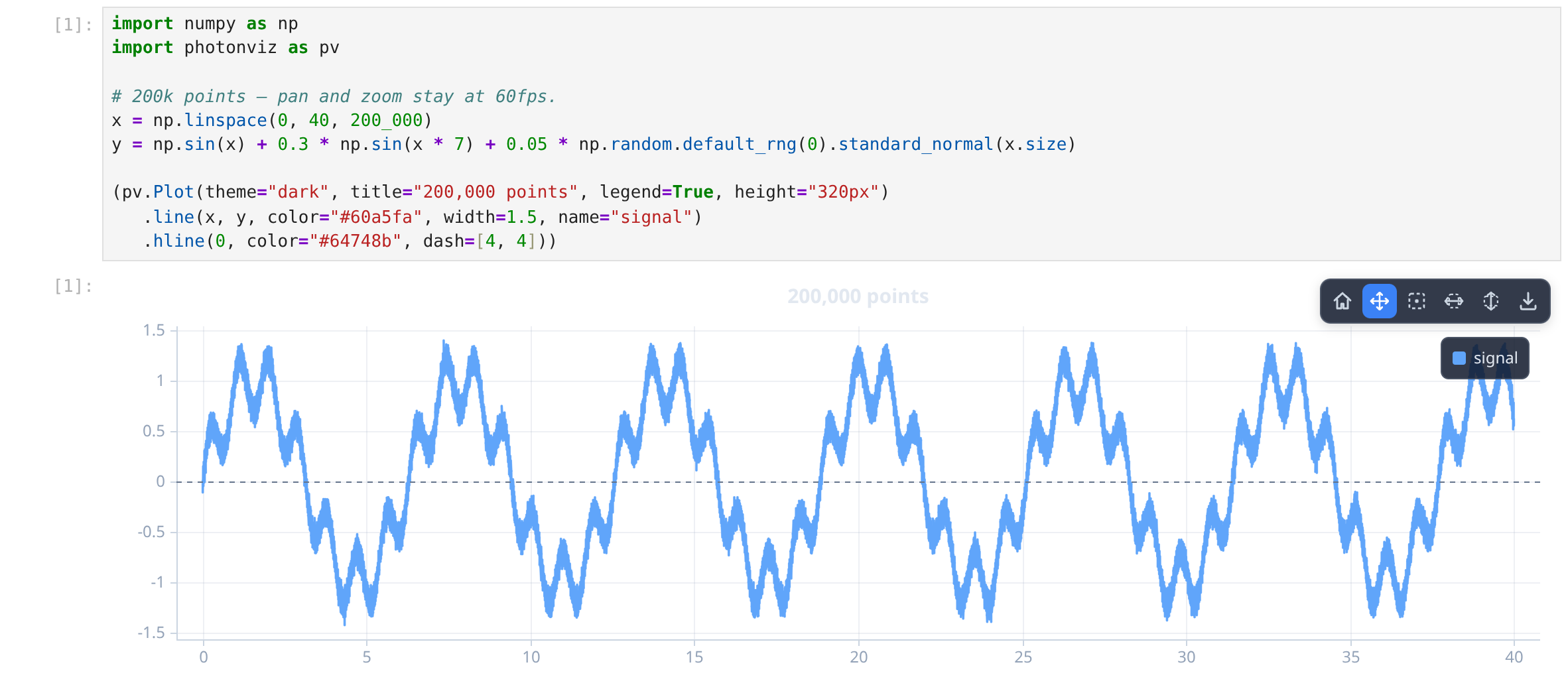
NumPy arrays and torch tensors cross to the browser as binary buffers, so a million points still pan and zoom inside a notebook cell.
Quick start
import numpy as np, photonviz as pv

x = np.linspace(0, 40, 200_000)
pv.line(x, np.sin(x), name="signal", plot={"theme": "dark", "legend": True})
Charts chain, and the last expression in a cell renders itself:
(pv.Plot(theme="dark", title="Two series", legend=True)
   .line(x, np.sin(x), name="sin", color="#60a5fa")
   .line(x, np.cos(x), name="cos", color="#f472b6", dash=[6, 4])
   .hline(0, color="#64748b"))
Every keyword maps 1:1 onto the TypeScript options, so everything in this documentation applies verbatim.
Google Colab
Run once per session, then use photonviz normally:
from google.colab import output
output.enable_custom_widget_manager()
What you can draw
pv.scatter(x, y, sizes=area, colors=hex_list)     # bubble chart
pv.histogram(samples, bins=40)
pv.heatmap(z, cols, rows, extent={"x": [0, 1], "y": [0, 1]}, colormap="magma")
pv.candlestick(t, o, h, l, c)                     # + heikin_ashi, bollinger, drawdown…
pv.regression(x, y, band=2)                       # OLS + confidence band
pv.corr_matrix([a, b, c], names=["a", "b", "c"])
pv.psd(signal, sampleRate=1000)                   # Welch spectrum
pv.confusion_matrix(y_true, y_pred)               # + roc_curve, pr_curve, embedding…
pv.surface(z, cols, rows) # 3D — orbit with the mousePlot, Plot3D and Polar are the full objects; the module-level names are one-line shortcuts. Pass plot={...} to configure the plot itself.
Matplotlib's field and raster types are here too:
pv.contourf(z, cols, rows, extent, levels=12, lines=True)   # filled contours
pv.pcolormesh(z, x_edges, y_edges)                          # uneven cells
pv.hist2d(x, y, bins=[64, 48])
pv.eventplot([spikes_a, spikes_b, spikes_c])                # one row per train
pv.streamplot(u, v, cols, rows, extent, colormap="plasma")
pv.barbs(x, y, u, v)                                        # wind barbs
Scattered samples get triangulated first:
pv.tripcolor(x, y, z, edges=True)          # flat-shaded triangles + the mesh
pv.tricontourf(x, y, z, levels=12)         # filled bands over the triangulation
pv.triplot(x, y, showPoints=True)          # the mesh on its own
Diagrams and the rest of the ML pack are one-liners too — pv.treemap, pv.funnel, pv.sunburst, pv.gauge, pv.sankey, pv.chord, pv.parallel_coordinates, pv.ridgeline, pv.partial_dependence, pv.attention_map, pv.pred_vs_actual, pv.residuals, pv.lift_curve, pv.learning_curve, pv.decision_boundary.
figsize and subplots
figsize is matplotlib's (width, height) in inches at dpi (100 by default), so figsize=(12, 7) is a 1200×700 figure. It works on any chart:
pv.Plot(figsize=(8, 4)).line(x, y)
pv.line(x, y, figsize=(8, 4))          # shortcuts take it too
pv.subplots returns (figure, axes) exactly like matplotlib — squeeze drops length-1 dimensions, so axes[i, j], axes[i] and axes.flat all work:
fig, axes = pv.subplots(2, 2, figsize=(12, 7), sharex=True, theme="dark")
axes[0, 0].line(t, loss).title("Loss")
axes[0, 1].roc_curve(scores, labels)
axes[1, 0].confusion_matrix(y_true, y_pred)
axes[1, 1].histogram(residuals)
fig
sharex / sharey link the panels' views, so panning or zooming one moves them all. Extra keywords (theme, legend, …) become every panel's defaults, and a panel's own options(...) wins over them.
For a layout that isn't a uniform grid, build it up by hand — panels can span cells, and each one picks its own kind:
fig = pv.figure(figsize=(12, 8), rows=2, cols=2, theme="dark")
fig.add_subplot(colspan=2).line(t, price)          # full-width top row
fig.add_subplot(row=1, col=0).histogram(returns)
fig.add_subplot(row=1, col=1, kind="plot3d").surface(z, cols, rows)
fig
The whole grid is one widget: the panels share a single comm and a single copy of the bundled engine, so a 2×2 figure does not put four copies of the engine in your notebook file.
Model architecture
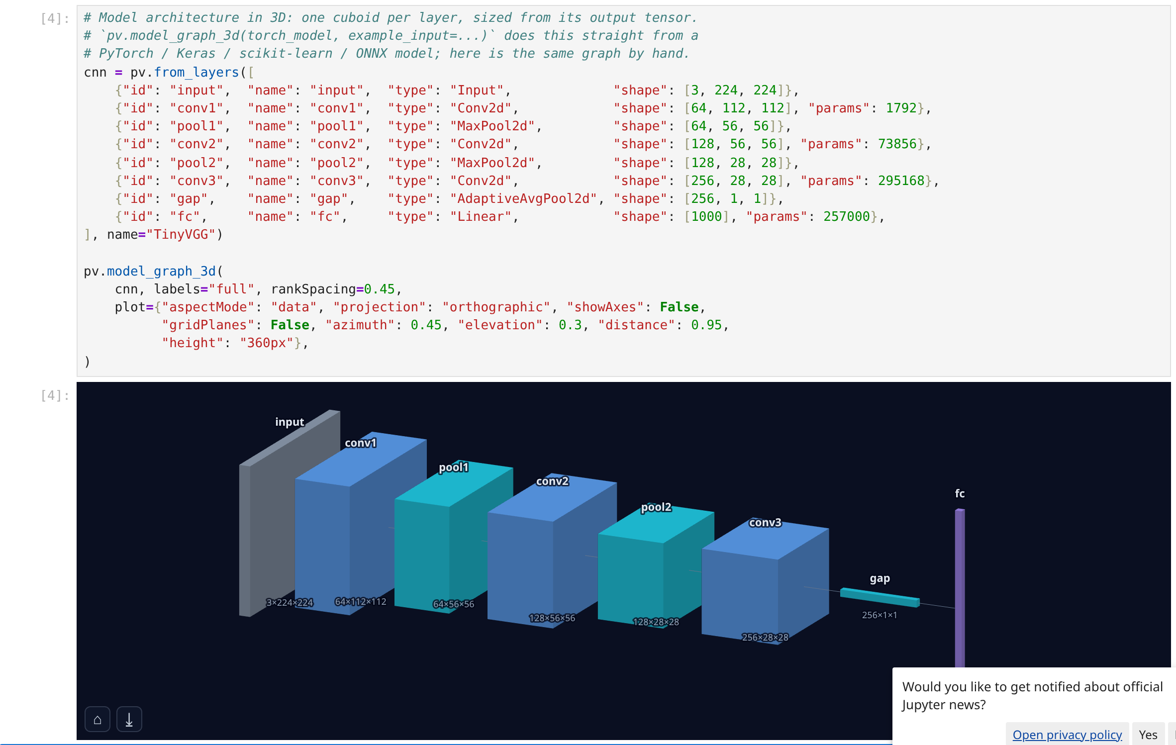
Hand a PyTorch, Keras, scikit-learn or ONNX model straight over — the export happens in Python, the layout in the browser.
pv.model_graph(model, example_input=torch.randn(1, 3, 224, 224), direction="horizontal")

pv.model_graph_3d(
    model, example_input=torch.randn(1, 3, 224, 224), labels="full",
    plot={"aspectMode": "data", "projection": "orthographic", "showAxes": False},
)
The exporters work standalone too: pv.from_torch, pv.from_keras, pv.from_sklearn, pv.from_onnx, pv.from_layers.
Example notebooks
Runnable, in the repo under examples/notebooks/:
quickstart.ipynb— a 200k-point line, a bubble chart with an OLS fit, a confusion matrix, a 3D model graph, a 3D surface.gallery.ipynb— distributions, fields, custom colours, finance, signal processing, ML metrics, model architecture and 3D.
API reference
Every class, method and shortcut: Python API — generated from the package itself, so the signatures are always the real ones.
How it works
photonviz is an anywidget, which is why one object renders in Jupyter Notebook 7, JupyterLab 4, VS Code and Colab with no per-frontend code.
Chart calls build a plain dict. On sync, every array-like is swapped for a {"$buffer": i} marker and its raw bytes are appended to a buffer list; ipywidgets ships those as binary. The browser rebuilds typed-array views and hands them to @photonviz/core. Colours, names, extents and other structural values stay JSON.